Sunday 11 February 2024

Stage 4 - Cut up into separate shapes

Test weaving

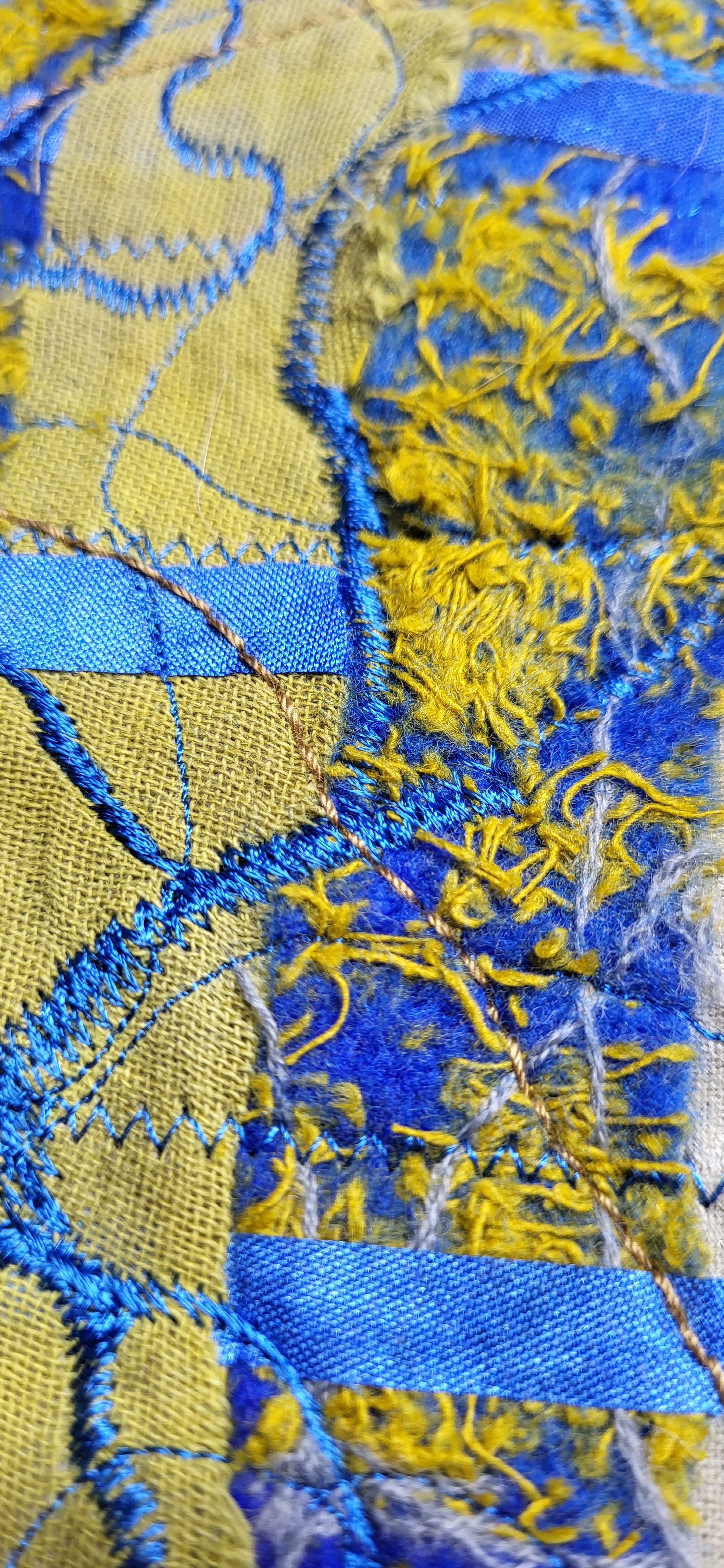
 This is a little test weaving where I tried to reproduce a richly textured surface reflecting the feel of an old and weathered industrial site. I used hatching to blend some colours but also did some needle punching and hand embroidery in some areas to introduce more textures. 


In the following samples I used paper as I didn't want to waste my precious fabric samples.

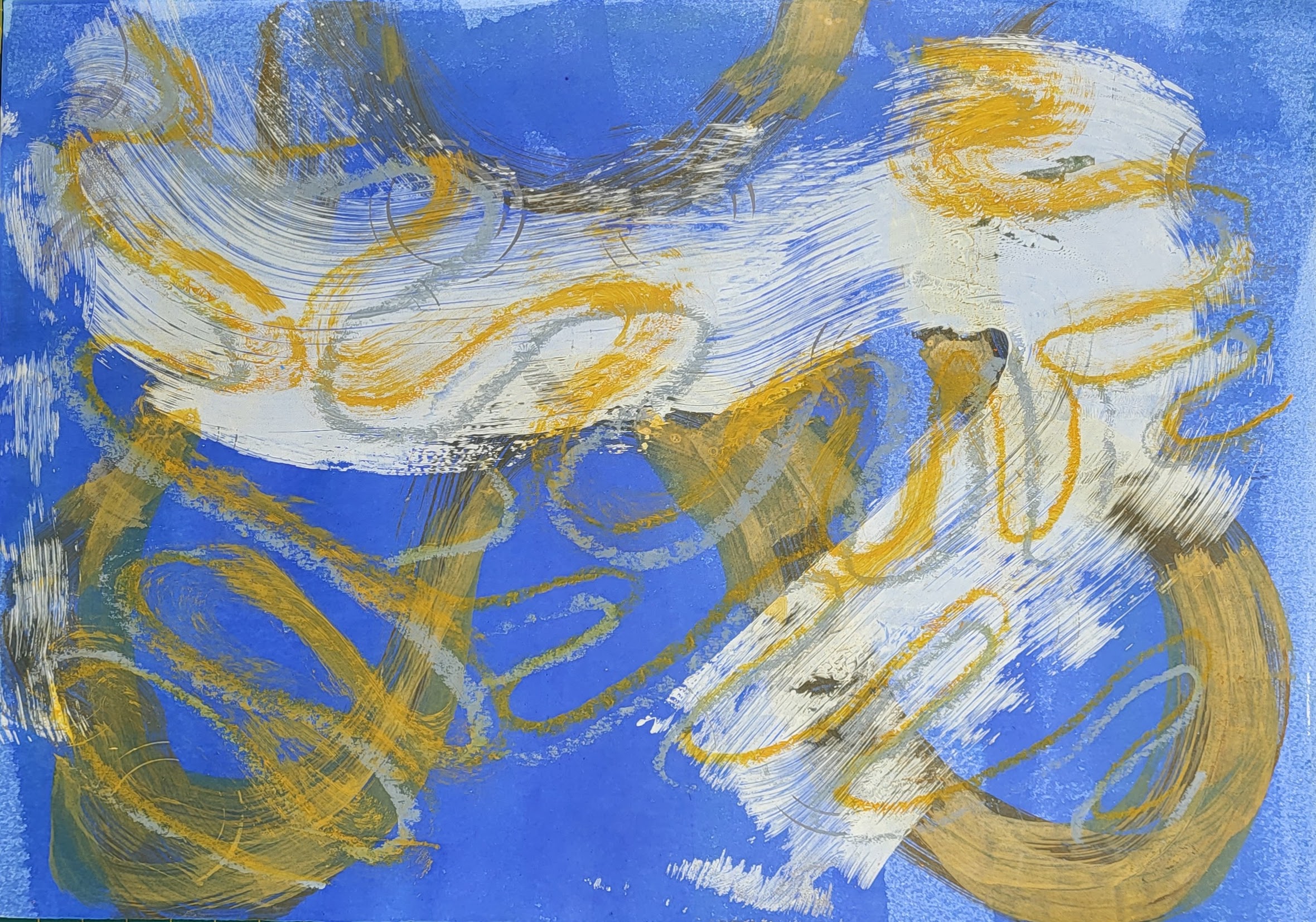
In order to reproduce the colours and textures more accurately, I took a picture of the fabric samples which I printed out on a A4 sheet of paper.


Sample 1


Sample 2


Sample 3


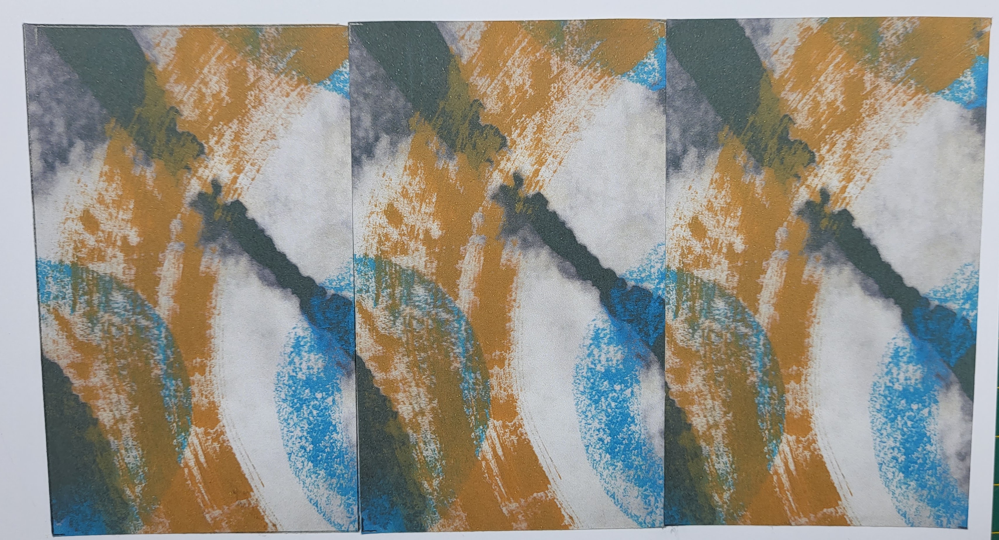
I decided that my initial shape didn't have enough potential and flexibility to develop further so I did some changes to it . The final shape allows more room for intertwining 


Sample 4

For more contrast the shapes were put onto a plain coloured background


Sample 5


Sample 6


No I have to make up my mind when it comes to the sewing and which sample to choose.


Before cutting out the shapes  outlined them first with cable stitch. This allows the fabric not to fall apart.

I opted for  a blue colour for the shape and for a beige colour for the curved lines with an ocre upper thread.
The shapes were traced on the back before being stitched and cut out.
The shape was mirrored .

Before the actual sewing I played around with them as I had an idea in mind and wanted to see what it would look like.

Some ideas before the sewing: shapes put onto the neutral background. They are not fixed yet but I like the way they ondulate, it looks more interesting than if they laid flat.


-------------------------------

I was very much attracted by the shape of the blast furnace which is the landmark of the Belval industrial site. It looks very majestic a bit like a fortress. 


I know it is a very simple (vase) shape but I like the idea of having this kind of "canvas" .
They are just some basic ideas which are difficult to get out of my head once they have settled in there:( 

Hereafter are some ideas where I played loosely with the shapes, pinning them onto some felted fabric wrapped around a piece of EVA foam.

The size of the pipe is not wright, it needs to be bigger.

Here the curved stripe was wrapped around the tube with the shapes intertwined, This is actually the sample I prefer as it relates to the idea of the conveyor belt where the finished items are transported. 
 
In the following example the shapes are put in an unorganized way onto the tube 


Monday 4 December 2023

Diploma - Chapter 12 - Towards an Embroidered Item - Choose background-Colour background-Add detail and pattern with stitching

 For this exercise I chose a neutral coloured coton in a grey/brown tone, knowing that, at least for the first fabric I would cover most of it.

This background fabric was then covered with Bondaweb which I pealed off before layering it with different fabrics and threads.

Fabric  1


Here the background got covered with different fabrics in a stripy pattern, knowing that the surface would be cut up and that this pattern would "disappear".

The main focus definitely lies here on the blue stripe which consists of a prefelt with dry  snippets of mustardy macramée threads from another project, felted in with the embellisher from both sides

The other stripes consist of fabrics in different tones of yellow or beige. The stripes were then fixed onto the background with a hot iron. 

Stitching was added with free machine zigzag in blue in a pattern inspired by one of the shapes from the previous chapters, more straight machine stitching was added in blue and yellow as well as a "normal" zigzag stitch in a horizontal grid.


Fabric 2


For this second fabric different snippets of fabrics were layered in a random way. They consist of a beige sheer silk, scrim, grey and light brown coton, acrylic painted yellow fabric, grey painted bondaweb as well as loosely layered threads in grey and yellow. The whole background was then stitched with mostly automatic swirly patterns in grey/beige. The thread is of a thicker quality so  is a little bit raised from the surface. As a last layer some free motion stitching was added in the same blue than in Fabric 1 with the goal to create some kind of link between the 2 fabrics.

  The main goal was to create two different, contrasting surfaces that were of a different colour scheme, but linked


Sunday 26 November 2023

Diploma Chapter 11 - Bold Design Development - Option D

 This was the first of the two exercises I worked on, as the painterly approach attracted me more. 

The chosen format for the painted papers was an A4 page.

I tried to reproduce the shapes used previously  using different mediums such as acrylic paints or wax crayons or shunky acrylic markers, enlarging the shapes and overlapping them. I thus achieved different textures and quality of the marks made (big and bold with finer lines). Some of the backgrounds were created with the gelli plate as this allowed for a quick coverage of a whole page. 

I copied the original papers which unfortunately changed the colours, in fact they appear duller and darker as they really are.


Marks made by painting on the gelli plate  with a big brush
curved lines with papers showing textures with rubbings.


bleached bold mark on black background, painted yellow half circle with blue circles drawn with a wax crayon.

Sample 1) 

cut in 4 sections, each one representing an interesting design


The following samples were taken from 1b

1c: detail repeated 3 times vertically 


Sample 2


Sample 3


3c : woven strips of  2 different papers, the blue clearly becoming the more dominant one


Sample 4


Sample 5